Showing posts with label united kingdom. Show all posts

Monday, 12 December 2011

Mapping Flows - An Update

In many previous blog posts I talked about my experiments in flow mapping (exhibit 1, exhibit 2 ...). Usually this was about migration or commuting data and in the course of writing an academic paper on the subject I also put together a small website about flow mapping, with some examples. Now I've done a follow-up paper to this which is just out in Environment and Planning B (a couple of extracts shown below).


The point of this work is not simply to make pretty pictures. That might be an interesting by-product but it is more about the process of taking data and giving it some kind of meaning by mapping it. This is by no means trivial when you're looking at migration or commuting patterns which link hundreds or even thousands of places.

With this much data, you often have millions of individual cells of data, so making sense of it can be impossible without some kind of visual approach - and that's really what the paper is about. It's not really very complicated - at least, not conceptually - but the power of this type of approach is in its ability to generate knowledge from raw data. 

In short, then, this kind of work is in many ways guided by Kenneth Boulding's maxim that "knowledge is always gained by the orderly loss of information".

Thursday, 16 June 2011

World Prison Populations

I was going to post something else on deprivation, and I will do again soon, but today it's time for something completely different. For one reason or another I've been thinking about prison populations in different countries in the world. Maybe it's because I've been watching Banged up Abroad on National Geographic! Anyway, I got interested in it and started looking at the data and publications on the International Centre for Prison Studies website. It's all very interesting and at times alarming but thanks to the people at ICPS we have a reasonably good idea about all this. The 8th Edition of the World Prison Population List puts the total prison population at about 9.8 million in 2008 - roughly the same as the total population of Sweden! A couple of quick 'top ten' charts now...


The United States, China and Russia account for almost half the total world prison population. The US total in 2008 was 2.3 million, which is more than the entire population of Latvia and more than half the total population of Ireland. The prison population is more than the city population of Houston and not far off the city population of Chicago. The United States also has the highest rate of imprisonment per 1,000 persons, as you can see below...


In 2008, the rate of imprisonment in the US was 7.6 per 1,000. Russia was next at 6.3 and then Rwanda at 6.0. European nations generally have a much lower rate, with the United Kingdom at 1.5, France at 1.0 and Sweden at 0.7.

You can play around with the numbers to discover lots of interesting facts. If the UK had the same imprisonment rate as the US then instead of having a prison population of 90,000 or so, it would have a prison population of 465,000. On the other hand, if the US had the same rate as the UK, they would have 458,000 prisoners and not 2.3 million. Food for thought...

Given the topic, I'll end this rather random post with this...

Friday, 25 February 2011

GDP in the EU27 and the United Kingdom

New data on regional gross domestic product (GDP) was published by Eurostat yesterday. It is for the year of 2008 and covers the 27 Member States. When you look at the data for NUTS 2 level the results are very interesting. When you account for purchasing power standards and index the EU average at 100, the highest figure is Inner London, at 343. The lowest figure is for the Bulgarian region of Severozapaden - officially the poorest region in the EU by this measure.

Here's how it looks on the map...


Clearly, the eastern and southern parts of the EU territory are 'poorest' by this measure and there are some major concentrations of low values in the accession states - particularly in Bulgaria and Romania. Of the 64 regions with a GDP of below 75% of the EU average, here's where they are:

"Among the 64 regions below the 75% level, fifteen were in Poland, seven each in the Czech Republic and Romania, six each in Bulgaria and Hungary, four each in Italy and Portugal, three each in Greece, France (all overseas departments) and Slovakia, two in the United Kingdom, one in Spain, as well as Estonia, Latvia and Lithuania."

Within the UK, there is significant variation, from 71 in West Wales and the Valleys to 343 in Inner London, though it is worth pointing out that GDP data is affected by commuting patterns, particularly in areas of high in-commuting like Inner London. Nonetheless, here's how it looks on the chart...


As you'd expect, this new data has led to various news stories, including this one by the BBC. The data on GDP are never as up to date as we'd like, but it is interesting looking across the regions of the EU and particularly so when we map it.

Monday, 24 January 2011

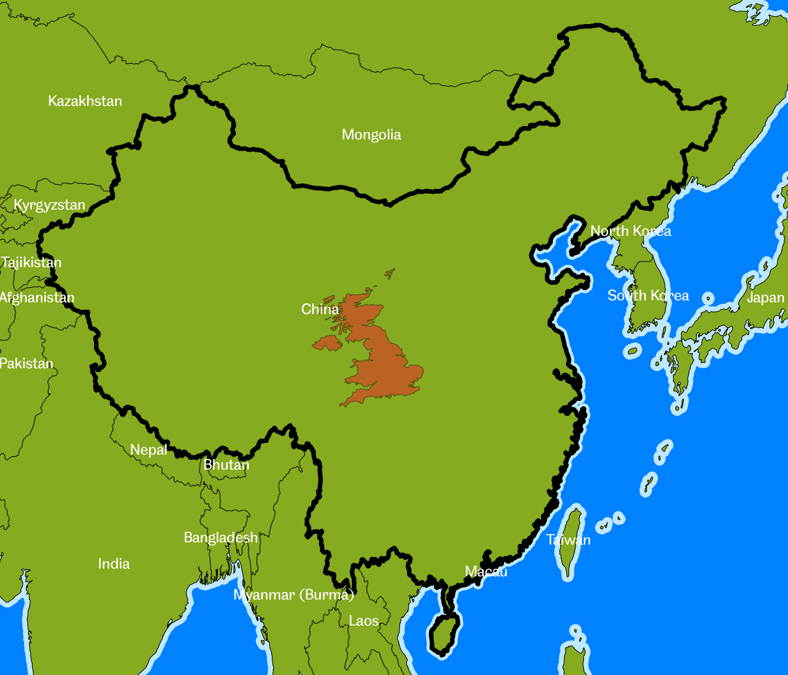
Exactly how big is the United Kingdom?

Following on from the theme of a recent post, about the size of different countries, I thought it would be interesting to compare the size of the United Kingdom to other parts of the world. The UK covers an area of about 243,000 square km., which is quite big in some ways, but not so big in others (ask any Canadian). It's all a matter of perspective. Some maps and facts below, with the UK superimposed on different parts of the world. Click the maps to see them in full size.

  • Russia is 70 times larger than the UK
  • Canada is about 41 times larger than the UK
  • The USA and China are both approximately 40 times larger than the UK
  • Brazil is 35 times bigger than the UK
  • Australia is about 32 times bigger than the UK
  • India is 13 times bigger
  • Sudan is 10 times bigger (n.b. now split in two since I originally wrote this)
  • Iran is 7 times bigger
  • France is twice as big (this is just the European part, not the overseas départements)
NOTES: I've used an equal area projection so there is a bit more map distortion than I'd like but this was just a bit of fun to make a point and remind myself of the relative size of the UK. For the USA I've shown the continental US and Alaska on separate maps. I've not shown Hawaii this time.

Wednesday, 30 July 2008

Spatial Planning - The New Rock and Roll?

Okay, the title is totally tongue in cheek because spatial planning is not exactly everyone's cup of tea (in fact, it's not a cup of tea at all). However, it is important even though most people haven't heard of it and many others who have don't know what it's all about. Over the past couple of years I've been involved in two projects relating to spatial planning, both of which were sponsored by the RTPI. One of them was recently published in full and in executive summary format - they can be accessed here. Believe it or not, this kind of work does have an influence and can help us better understand spatial processes and how they might impact on all kinds of areas and a variety of different activities. A couple of thumbnails showing the cover pages of the reports resulting from this work...


July has been a busy month with conference, writing and visiting different places so hopefully there will be more activity here in August.