Showing posts with label china. Show all posts

Wednesday, 13 June 2012

Why I Like 3D Maps

I do quite a bit of spatial analysis and mapping in my academic research, and some of it ends up on this blog. Over the past few years I've done quite a few 3D* maps - most recently one of population density in China. A comment by map-guru James Cheshire made me think about the 3D issue, hence this post, which attempts to say a little more about why I like using the third dimension, as it were. Also, there's not much about this stuff online at present. The two images below show population density in Europe at NUTS3 level, with a colour scale running from red (high density) to blue (low density). Click the images to enlarge.


*N.B. Data for some parts of Italy, Germany, and the UK are missing, 
but that doesn't matter for now - this is just an example.

The reason I like the addition of the third dimension with this kind of dataset is that you can tell more about the differences between areas within the same statistical category. Essentially, it adds an additional dimension of information that you can not observe from the conventional 2D map above. This is particularly true of the most high density areas in the first map. There is of course an issue here about the relative size of areas and how this might change the population density of different places but that is a different matter since I'm not in control of NUTS3 definitions! For more on this kind of thing I'd recommend looking at Stan Openshaw's work and for more on the utility (or futility?) of choropleths generally Tobler (1973) is an excellent starting point. Gale and Halperin (1982) is also worth a look.

If we assume that the main purpose of a choropleth map is to present and discover spatial patterns then there is sometimes a strong case for using the vertical dimension and extruding polygons using a z-variable (I do this in ArcScene, in case anybody is interested). However, there are some complications and I don't think it is always appropriate to go 3D. For example, depending upon the spatial structure of your data extruded polygons in one area can obscure those in another. There is also the issue of the different size of areas and the way these might have an impact upon the level of extrusion - i.e. if we used 1km cells for the European population density map it would look rather different in 3D - though this is possibly another artifact of the modifiable areal unit problem, as described by Openshaw. I've patched together three different examples from my blog in the image below, just for comparison. Another option would be to follow the example of Ben Hennig and produce population-weighted cartograms.


When I produce these 3D maps (or visualisations) I'm not trying to create a geographically precise rendering of space but rather I'm attempting to draw attention to variations in a dataset in a way which 2D maps can only do to a limited degree. They are abstractions and simplifications but in terms of understanding the world I find it can be an improvement. There is a little bit about it in this Environment and Planning B paper I wrote but I plan to write more about this in the near future (the'near future' in geological terms of course). 

*Also known as 2.5D in the GIS world, but I'll put that to one side for now...

Monday, 11 June 2012

The Population of China

In a few weeks I will be travelling to China for a conference, where I'm co-presenting a paper on regional inequalities in China and the EU. This has meant I've had to get hold of lots of Chinese datasets, some of which I have produced maps from - so I thought I'd post one or two here, along with some facts and figures. I should point out that most of the data I've been using has come from the National Bureau of Statistics of China website. 

Higher resolution version

In this 3D map I've just extruded the surface using population density data at a very local level. This required a reasonable amount of computing power but the effect is simply to emphasise the significant West/East split in population within China. This geographical division has been the topic of discussion for a long time and in relation to a number of areas but is generally referred to as the Hu Huanyong line (also sometimes the Hu line, Heihe-Tengchong Line or Aihui-Tengchong Line), after the Chinese population geographer of the same name. Strangely enough, there is a Facebook page dedicated to the Hu line. The line divides China roughly into two parts. In 1935 when Hu first identified the split, the West had 57% of the area and 4% of the population. Today, the East has 94% of the population of China, but only 43% of the area. You can see how this looks in the map below... 


I'm still working on my parts of the presentation but am really fascinated by the facts and figures emerging from the 2010 Chinese census and data for different regions of China. China accounts for almost exactly 20% of the world population and both Beijing and Shanghai (i.e. the provinces) have 20 million or more people. I still need to learn a lot more about China, Chinese data and regional development there generally but my work so far suggests that patterns of regional inequality - while different in absolute terms - are often strikingly similar to patterns of regional inequality in Europe. A good example of this is in Jiangsu province, to the north of Shanghai.

Citations: Center for International Earth Science Information Network - CIESIN - Columbia University, International Food Policy Research Institute - IFPRI, The World Bank, and Centro Internacional de Agricultura Tropical - CIAT. 2011. Global Rural-Urban Mapping Project, Version 1 (GRUMPv1): Population Density Grid. Palisades, NY: NASA Socioeconomic Data and Applications Center (SEDAC). http://dx.doi.org/10.7927/H4R20Z93. Accessed 10 June 2012.

Balk, D.L., U. Deichmann, G. Yetman, F. Pozzi, S. I. Hay, and A. Nelson. 2006. Determining Global Population Distribution: Methods, Applications and Data. Advances in Parasitology 62:119-156. http://dx.doi.org/10.1016/S0065-308X(05)62004-0.


P.S. Thanks are due to Chunhua Liu for her insights here!

Thursday, 8 September 2011

Comparing Populations: China, US, Europe

Since the US and China have both recently (2010) conducted a census I thought it would be interesting to look at some of the population results. Given the vastness of the US and China, I thought I'd do a little experiment and compare Chinese province populations with US states and European countries. I've put this data into a spreadsheet as well and also produced a map graphic comparing various areas. The purpose here is to highlight the large populations of so many Chinese provinces.


Some interesting nuggets from the data...
  • Guangdong province in China now has a population of 104 million, which is more than any European nation except Russia (141 million). The European part of Russia has 110 million. 
  • Poland, Shanxi province and California all have around 37 million people. 
  • Shanghai has 22 million compared to Romania at 23 million. 
  • Beijing and New York state both have about 19.5 million people. 
  • In total, ten Chinese provinces have a population of 50 million or more. The US and China have a very similar land area. 
  • Be honest, did you know that Anhui province has about the same population as Italy (60 million)?
Finally, some non-Chinese comparisons. Greece and Ohio both have a population of about 11.5 million and Michigan and Belarus are similar at about 9.5 million. Wisconsin and Denmark both have about 5.7 million people, and Finland and Minnesota have about 5.4 million. At the lower end of the scale, North Dakota and Montenegro both have about 670,000 people.

Monday, 24 January 2011

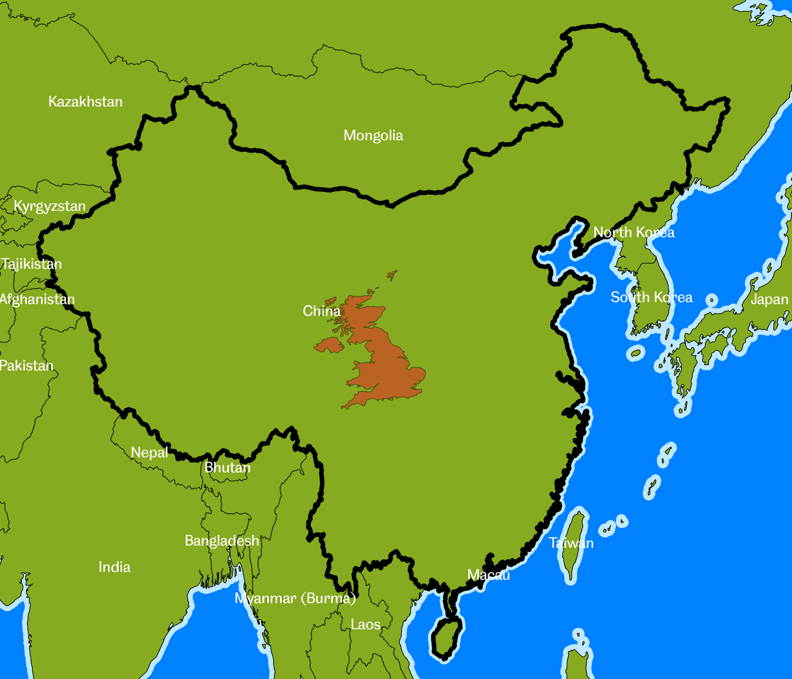
Exactly how big is the United Kingdom?

Following on from the theme of a recent post, about the size of different countries, I thought it would be interesting to compare the size of the United Kingdom to other parts of the world. The UK covers an area of about 243,000 square km., which is quite big in some ways, but not so big in others (ask any Canadian). It's all a matter of perspective. Some maps and facts below, with the UK superimposed on different parts of the world. Click the maps to see them in full size.

  • Russia is 70 times larger than the UK
  • Canada is about 41 times larger than the UK
  • The USA and China are both approximately 40 times larger than the UK
  • Brazil is 35 times bigger than the UK
  • Australia is about 32 times bigger than the UK
  • India is 13 times bigger
  • Sudan is 10 times bigger (n.b. now split in two since I originally wrote this)
  • Iran is 7 times bigger
  • France is twice as big (this is just the European part, not the overseas départements)
NOTES: I've used an equal area projection so there is a bit more map distortion than I'd like but this was just a bit of fun to make a point and remind myself of the relative size of the UK. For the USA I've shown the continental US and Alaska on separate maps. I've not shown Hawaii this time.

Wednesday, 22 December 2010

The Size of Countries: USA and China

There have been a few blog posts elsewhere recently about the size of Africa. Kai Krause was the original blogger on this with his 'True Size of Africa' map, which is very impressive. This was picked up by a couple of other blogs, including the Economist's take on it and the Spatial Analysis blog at CASA.


I've recently been looking at this kind of thing from a different perspective but still in relation to the size of countries. Some of this has involved playing around with regions, nations and population data. I thought it would be interesting to look at the USA and China since they are very similar in area but very different in population.

Some images below. Click to view them full size. This first one puts the USA and China side-by-side with population data included and the second one superimposes China on the USA's land area.